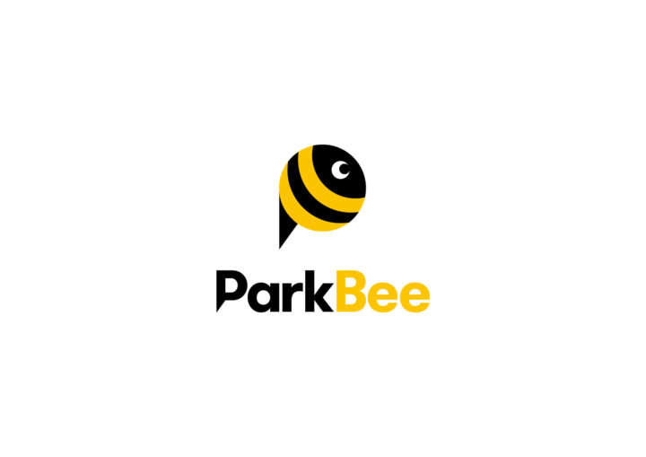
ParkBee’s founders discovered inspiration in the characteristics of a honey bee—a diligent creature that works industriously, contributes to the community, and exudes a friendly demeanor. This ethos is encapsulated in the company name itself.
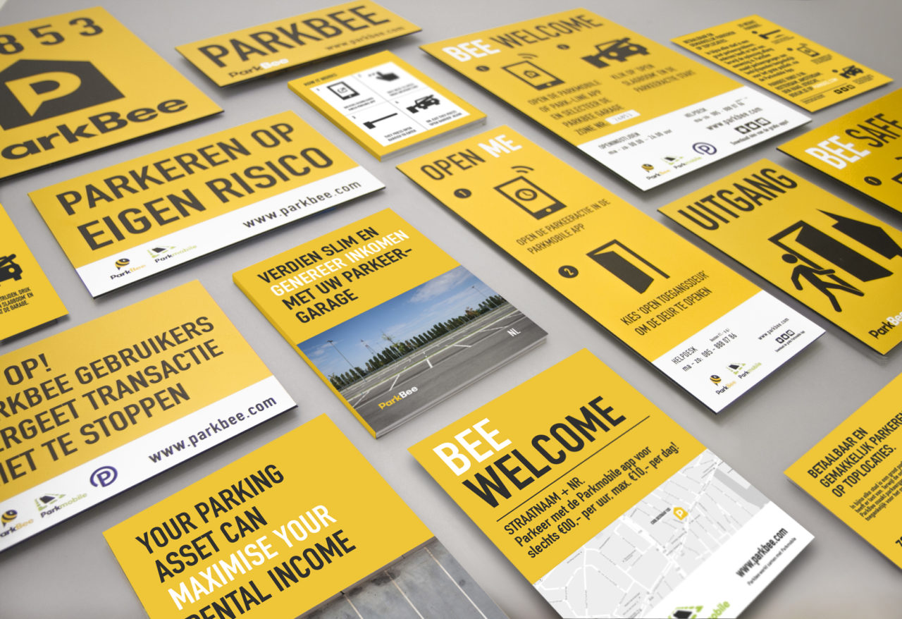
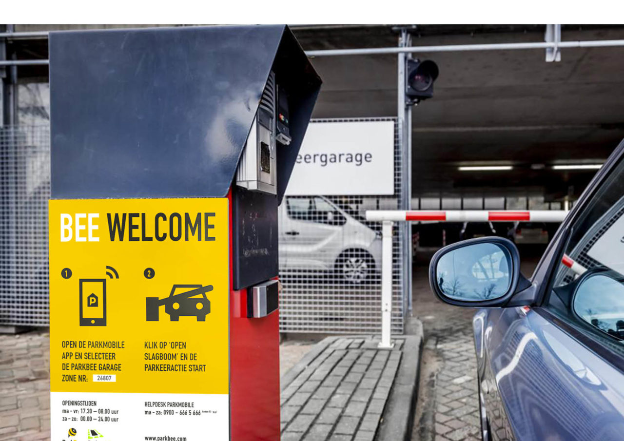
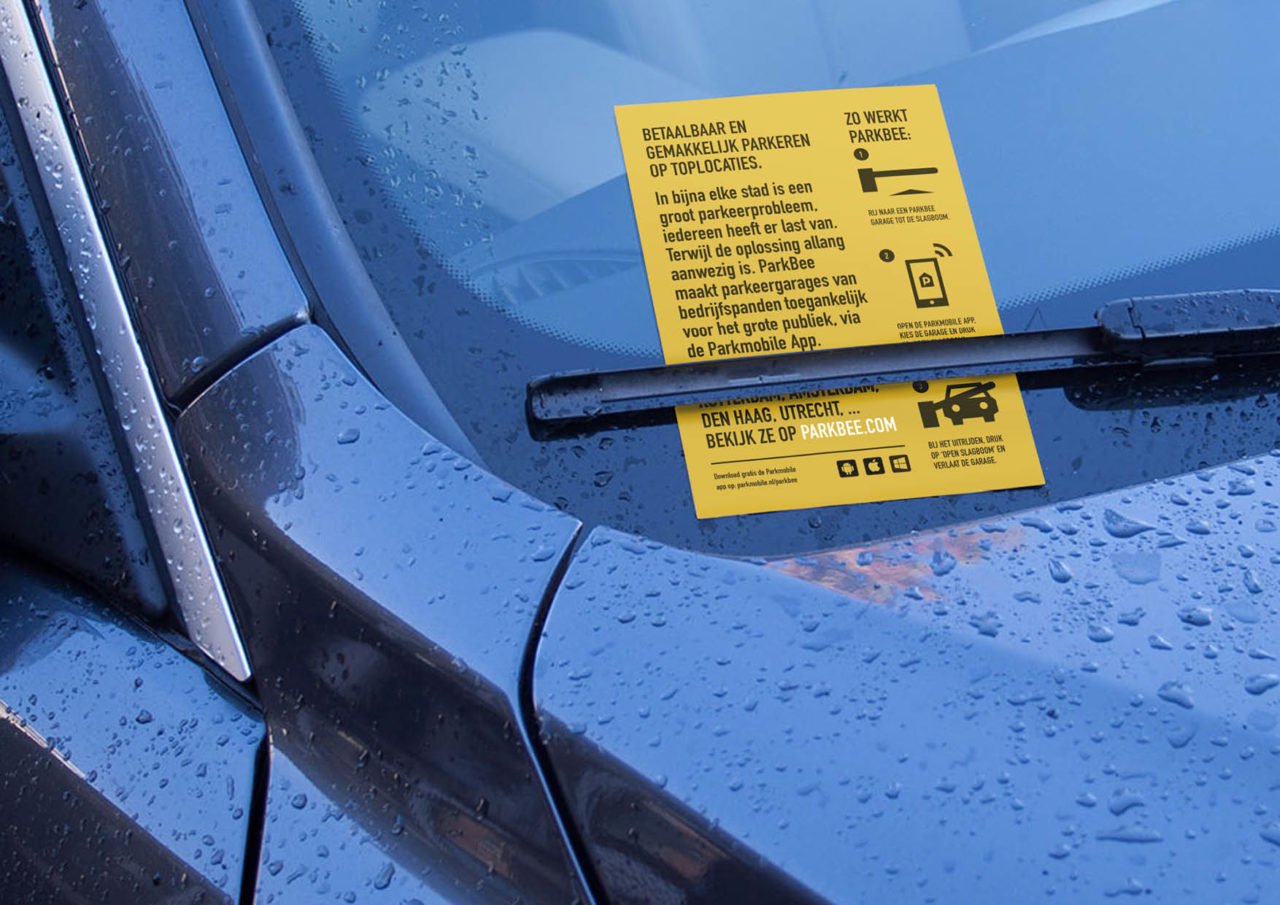
The logo, a visual representation of ParkBee’s identity, cleverly combines the P of ParkBee with the distinctive red pin of Google Maps. The result is a universal parking icon encased in a ‘bee-shaped’ location marker, proudly showcasing ParkBee’s signature yellow and black signal colors. The choice of Traffic Yellow ensures visibility in outdoor signage and eye-catching printed materials.
Crafted by our studio, the logo emanates a friendly and approachable aesthetic. Its simplicity, clarity, and a touch of whimsy are embodied in semicircular lines, reminiscent of a smile. Why? Because, with ParkBee, parking ceases to be a tedious chore—it becomes an experience that brings joy to both visitors and building owners.