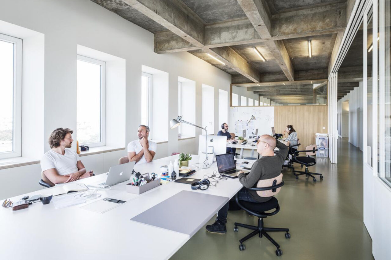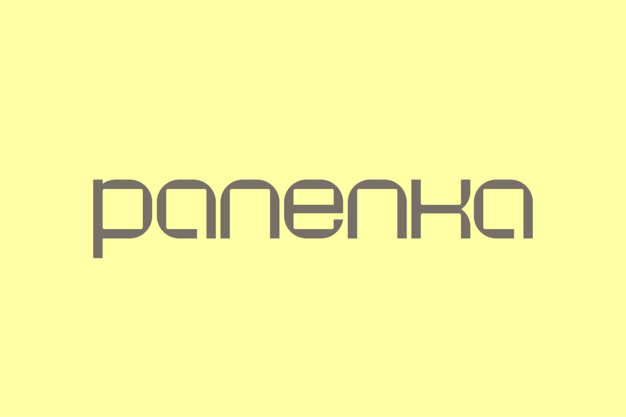
Panenka has earned a distinguished reputation among viewers in Flanders and the global production industry. Our studio created a revitalized visual identity that perfectly aligns with their professional, passionate and lively character.
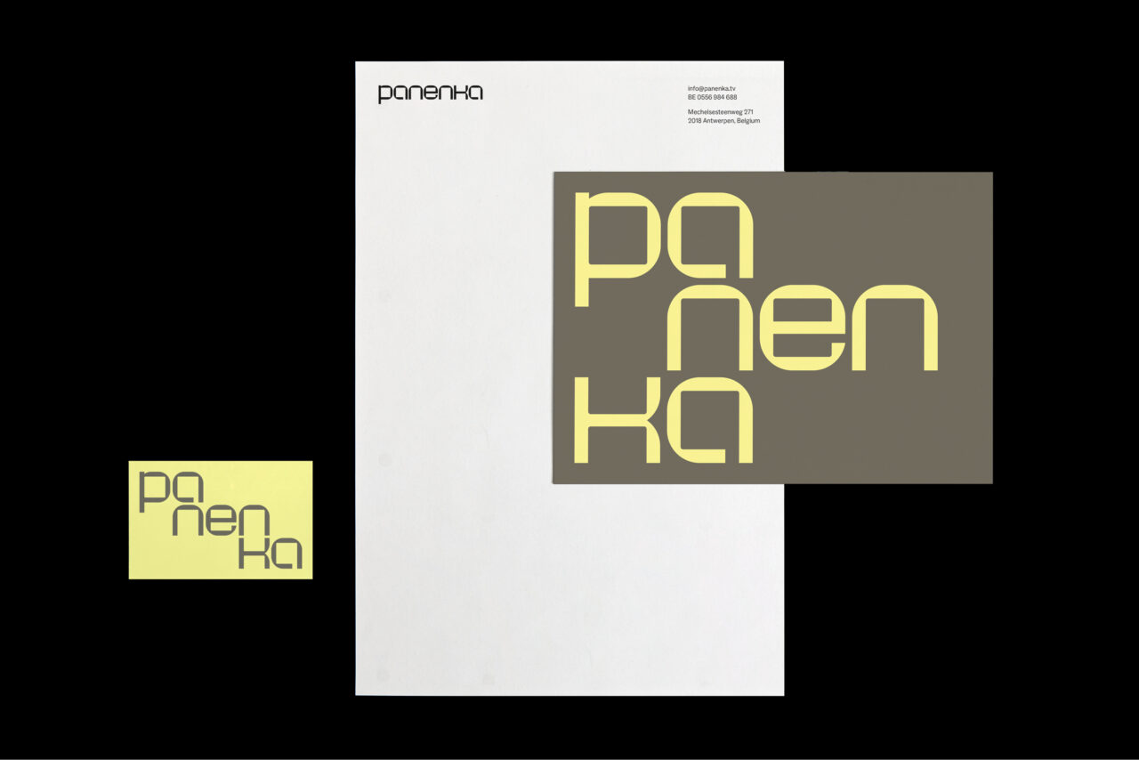
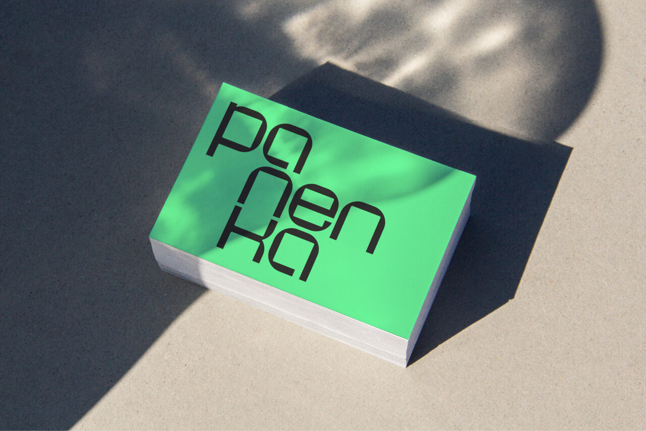
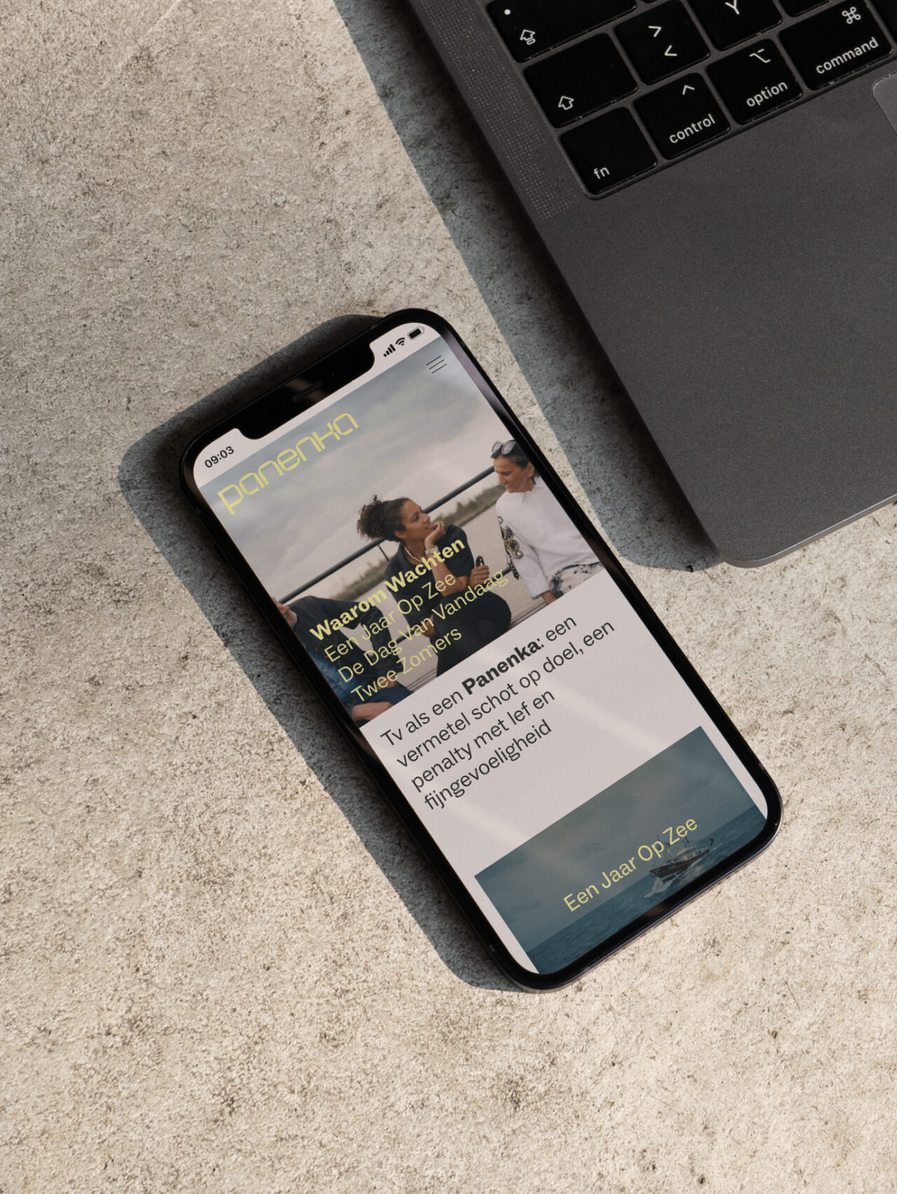
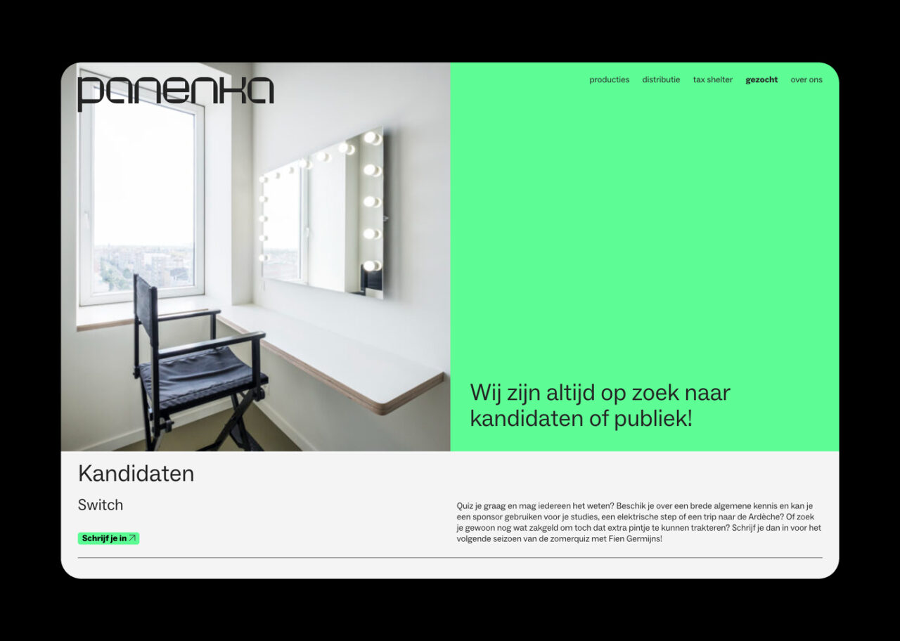
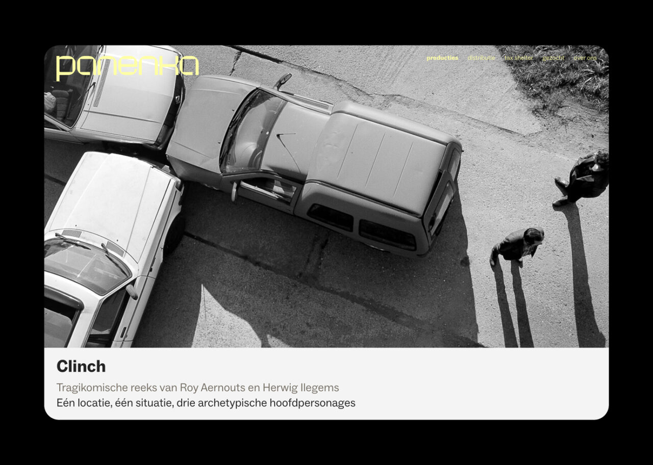
The old identity was given a thorough update, while maintaining the existing aesthetic. Panenka’s recognisable yellow colour was given a more sophisticated colour tone and the logo a more contemporary look. The new logo can be used flexibly as a wordmark, allowing Panenka to keep communicating dynamically in different channels. As a nod to their earlier logo and friendly yet professional character, we developed quirky letters that have a mechanical yet rounded appearance.
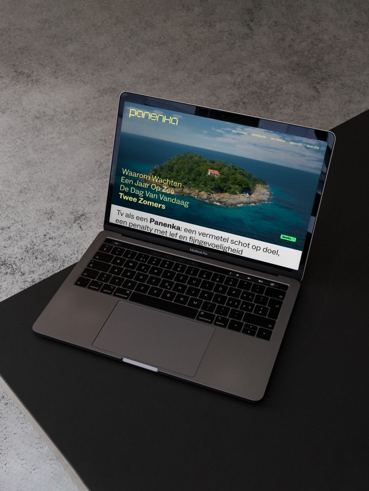
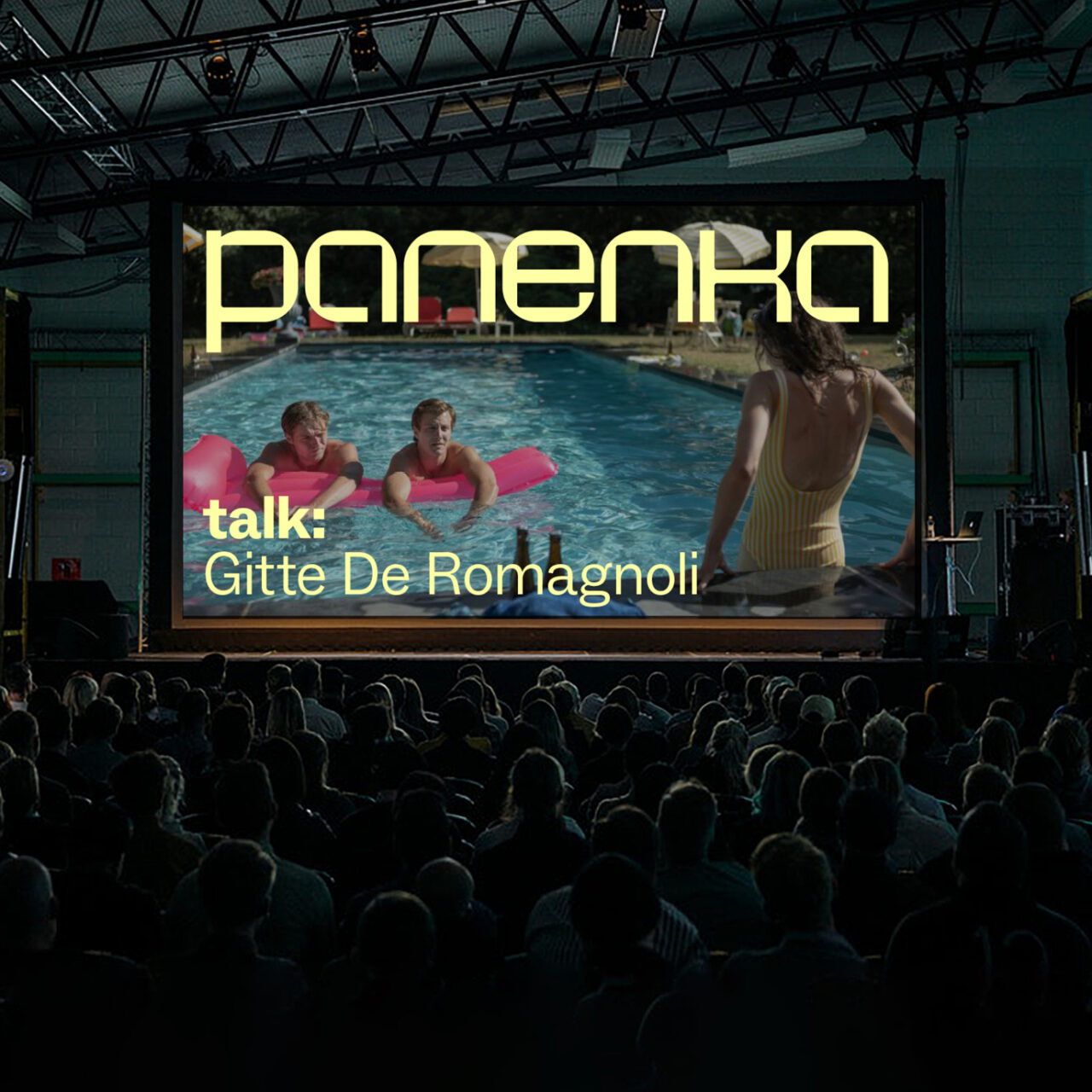
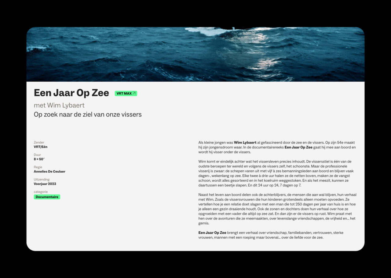
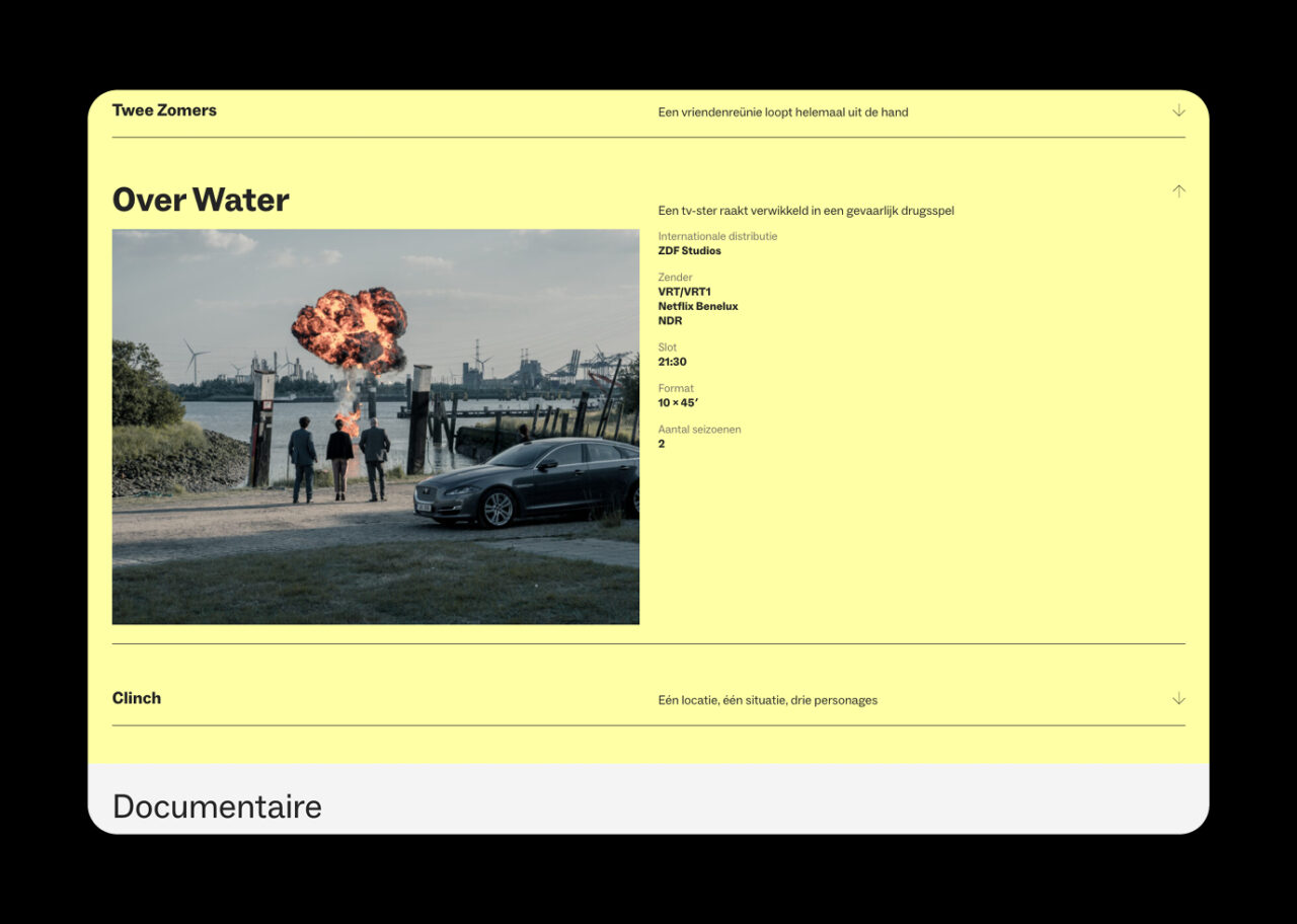
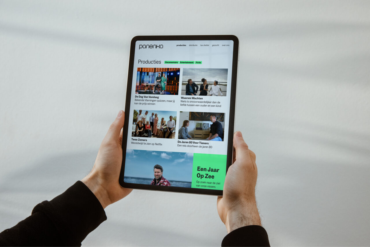
In addition, we created a website with a strong focus on video content. The website strikes a balance between elegance and boldness, offering a wide range of layout possibilities. It effectively conveys the warmth and personality of Panenka, while showcasing the exceptional strength and quality of their productions.
Our collaboration embodied their legendary motto: “An audacious shot on goal, a penalty executed with both bravery and finesse.”