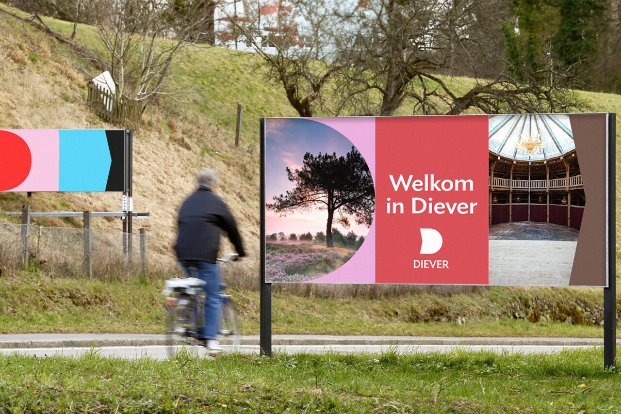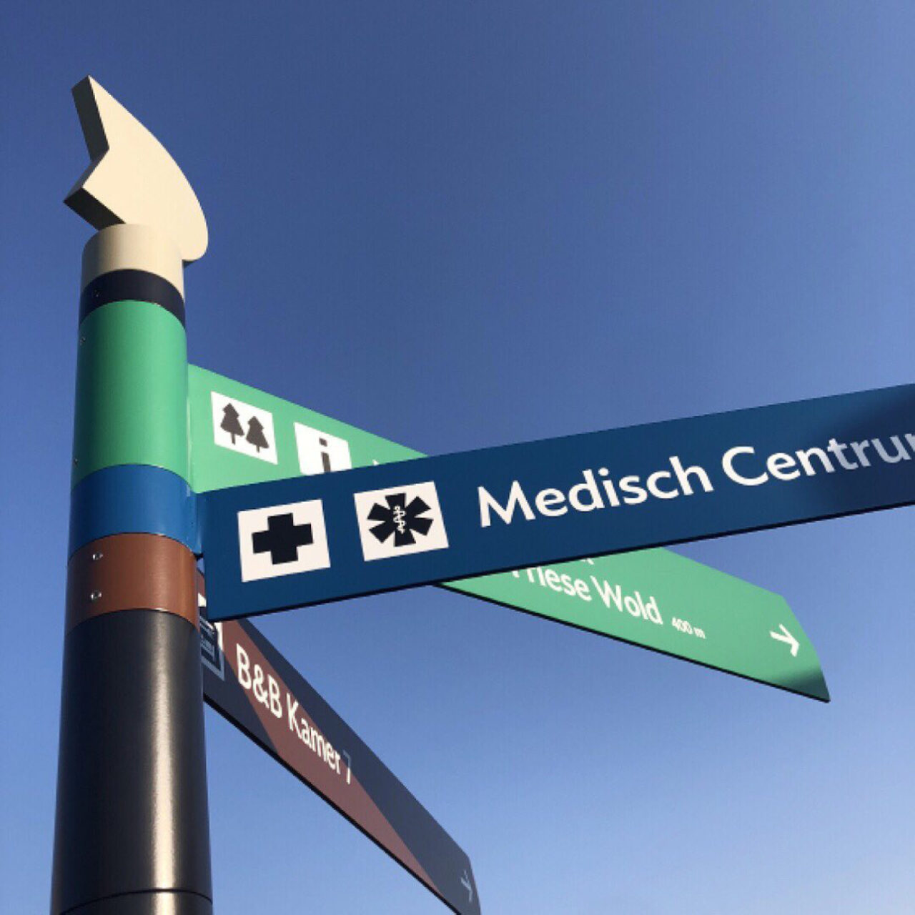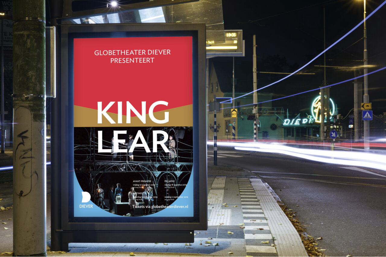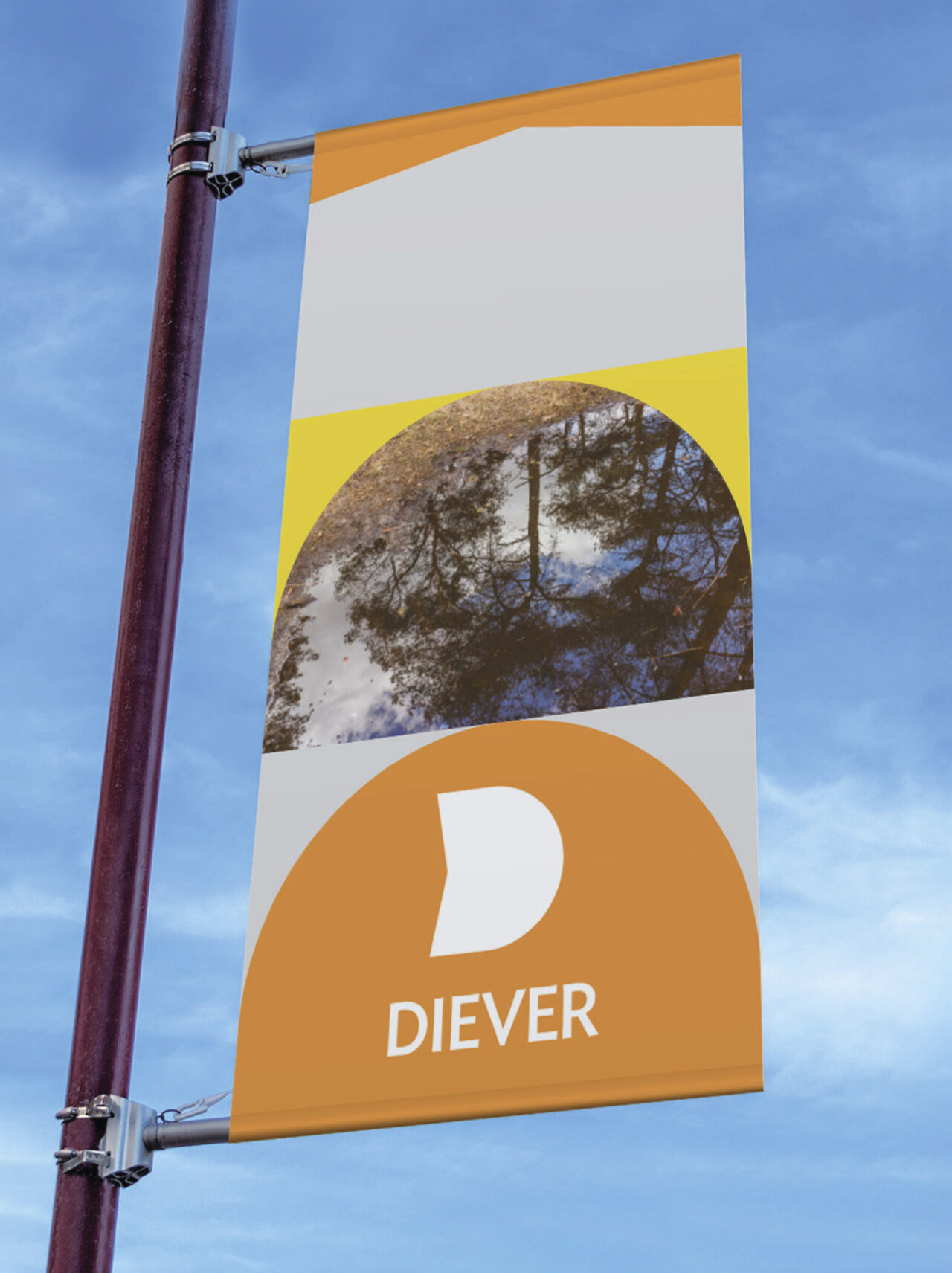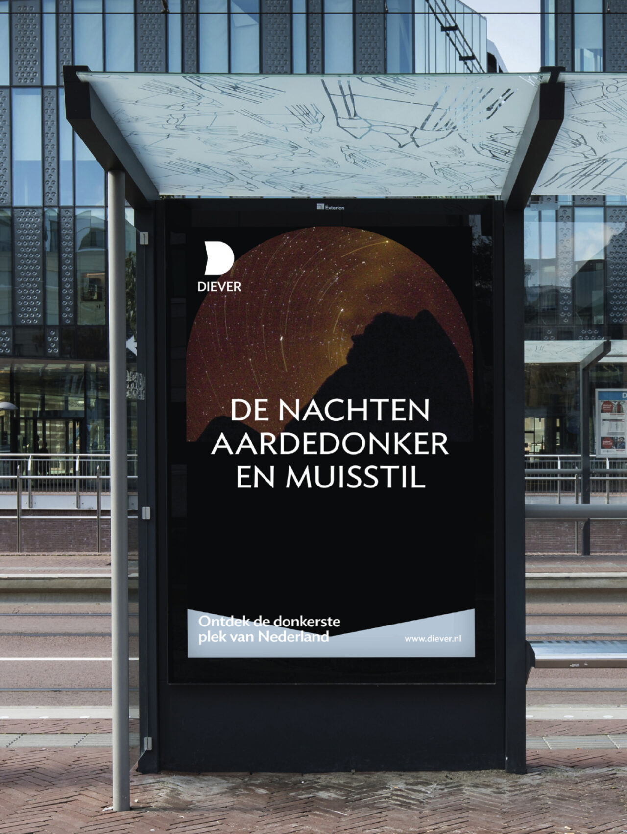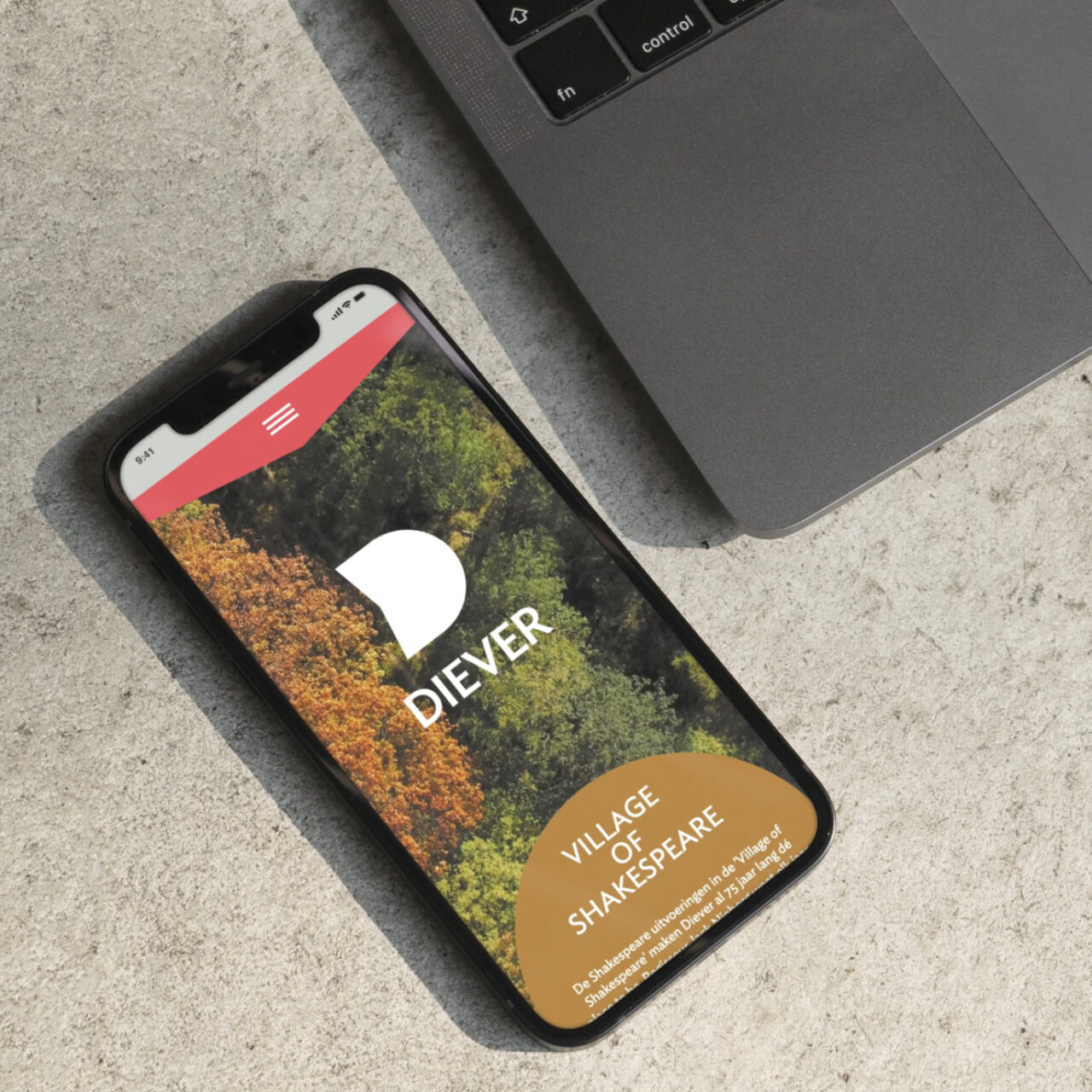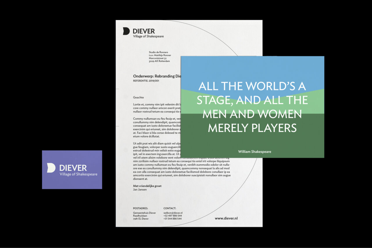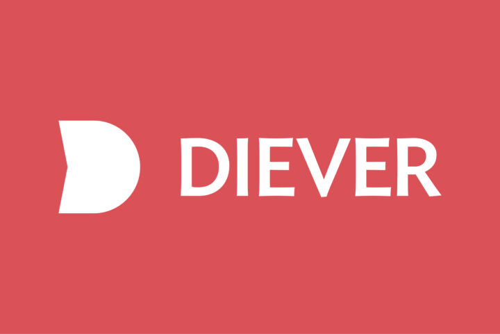
Diever wants to reposition itself in Drenthe, the north and even the whole of the Netherlands, as a lively and cozy place for residents and visitors. Our studio developed a rebranding — from the logo and slogan to signposts and customisable goodies — to realise this ambition.
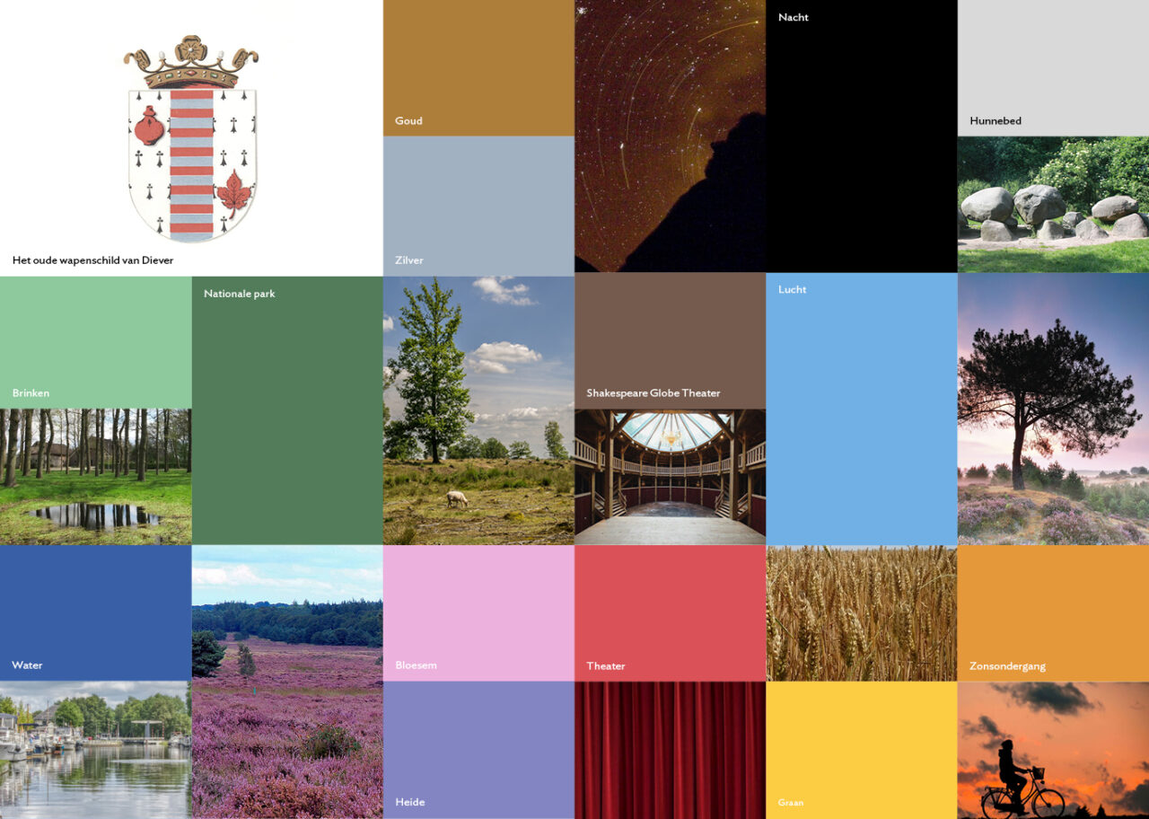
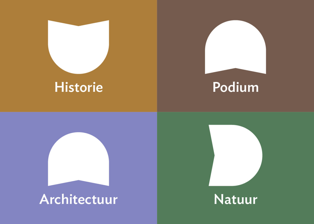
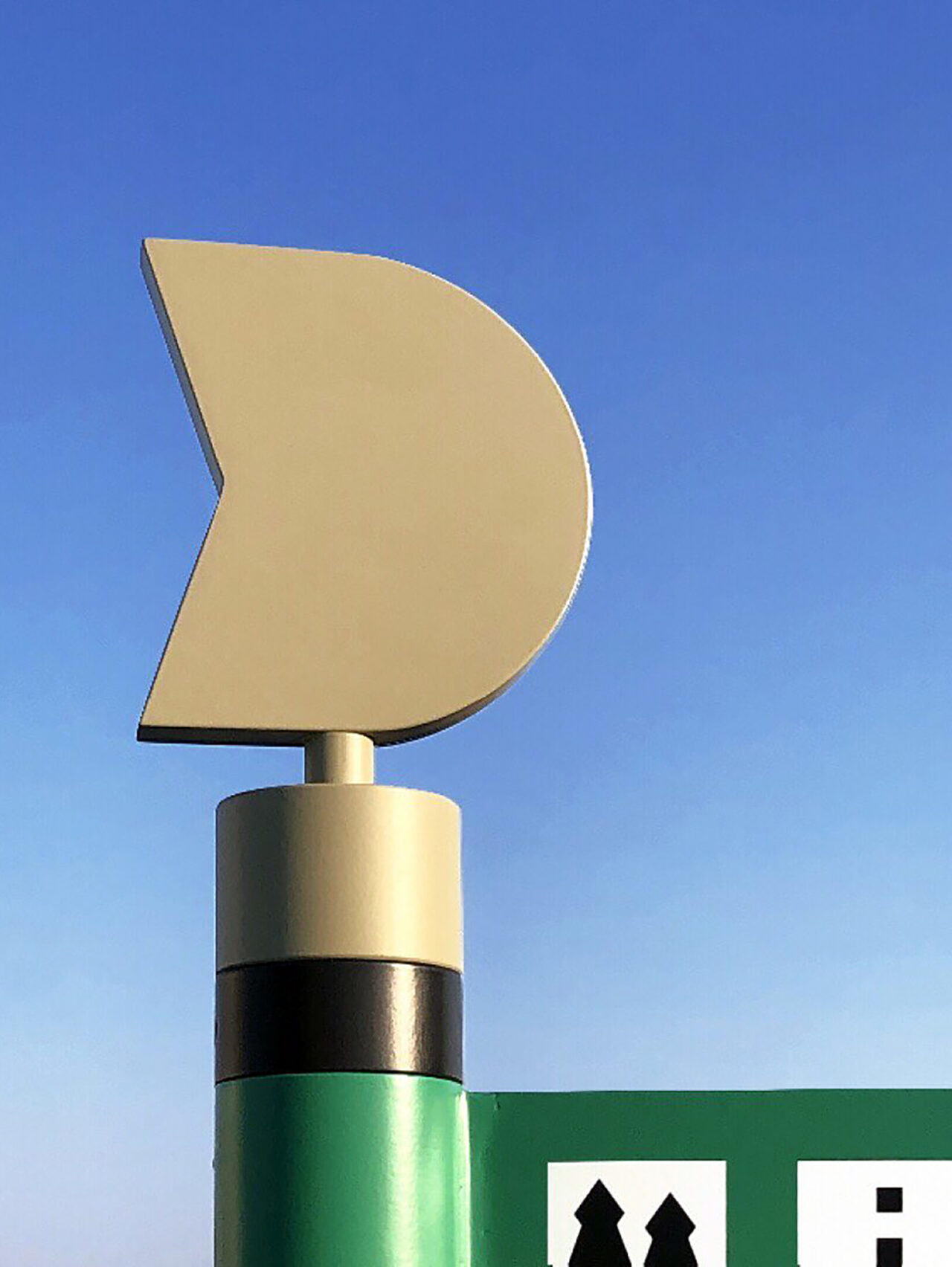
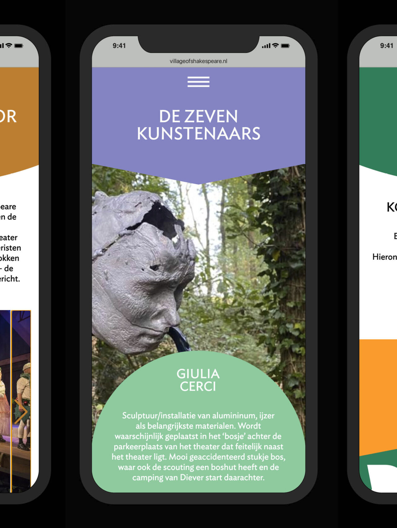
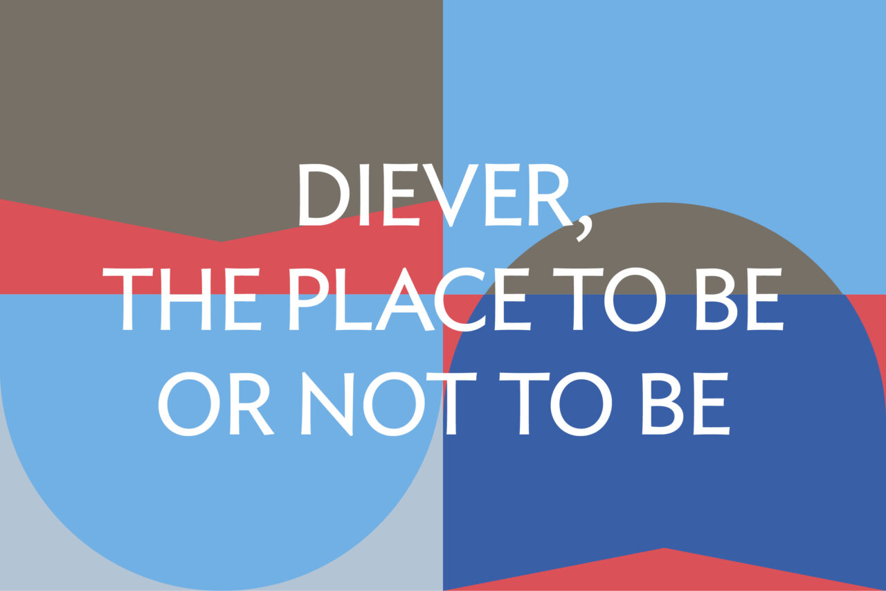
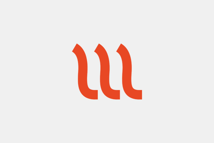
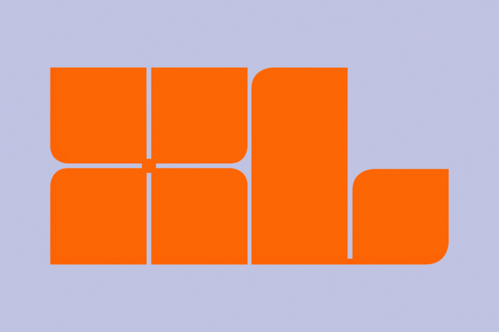
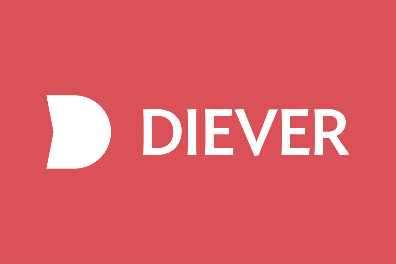
Diever’s new symbol is a distinctive letter ‘D’. The logo connects and highlights the various characteristics of Diever, is recognisable for it’s residents and inviting to visitors. The design originated from extensive research into the village and its history. The shape of the logo is a nod to the Shakespeare theatre and Diever’s historical coat of arms. Furthermore, we created the slogan “Diever. The place to be or not to be”. This slogan not only connects Diever to Shakespeare, but also promotes the village as a place where there is much more to experience! Thanks to the rebranding and a well-defined Brand book, Diever can mark its products and events as ‘real Dievers’. Together with all stakeholders, the municipality of Diever can proudly present itself as a worthwhile city brand.