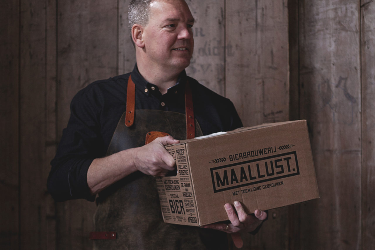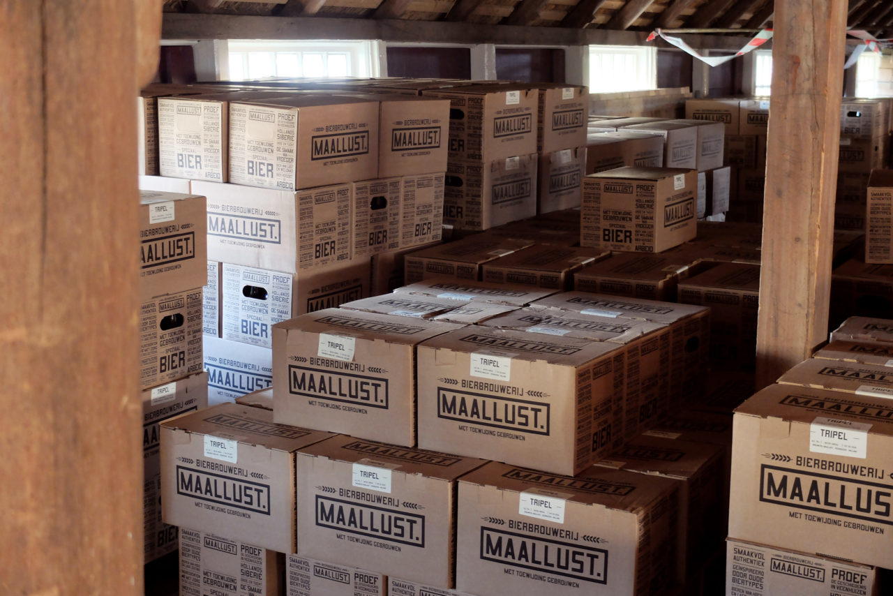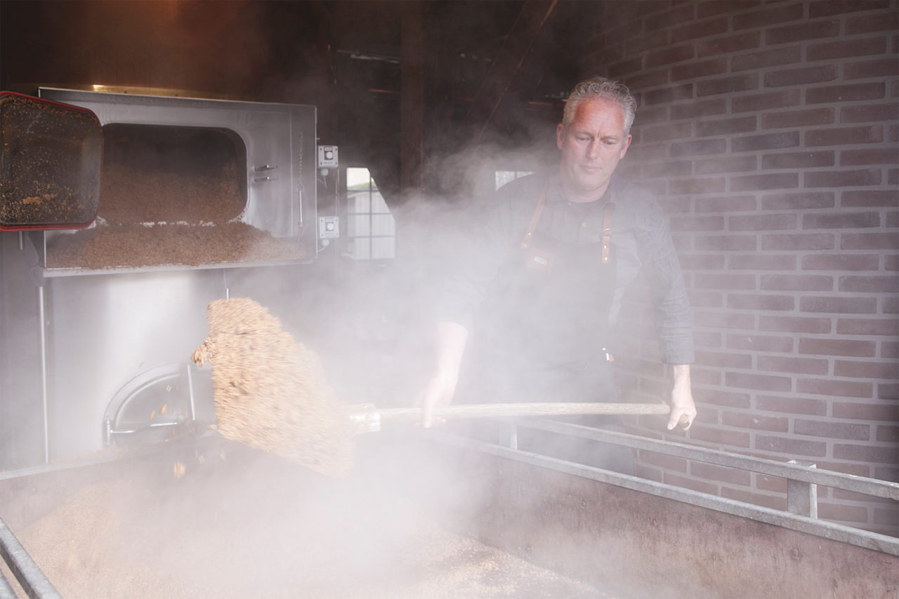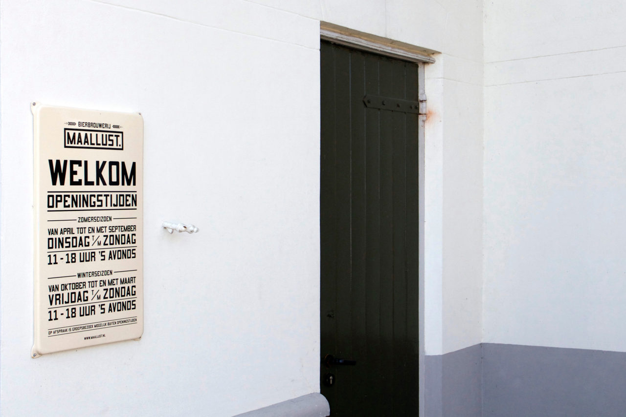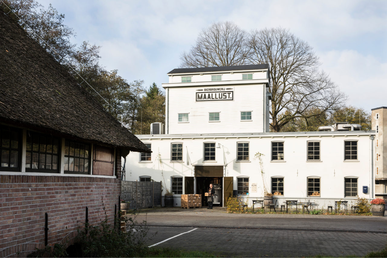
Maallust Brewery was founded in a newly rediscovered grain mail in the former ‘prison village’ of Veenhuizen. Here, twenty-five passionate entrepreneurs and brewers fulfilled their dream of creating their own brewery with a signature style. One of the key ingredients of a successful microbrewery is good branding: the name and design, inspired by Veenhuizen’s turbulent history, have helped Maallust become the largest craft beer brewery of the Northern Netherlands.
ORDER AND DISCIPLINE
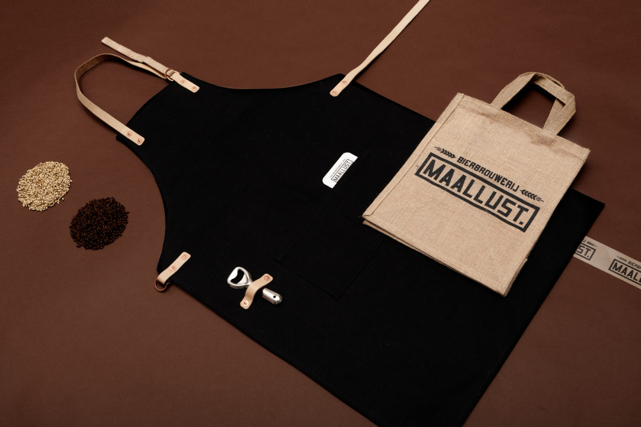
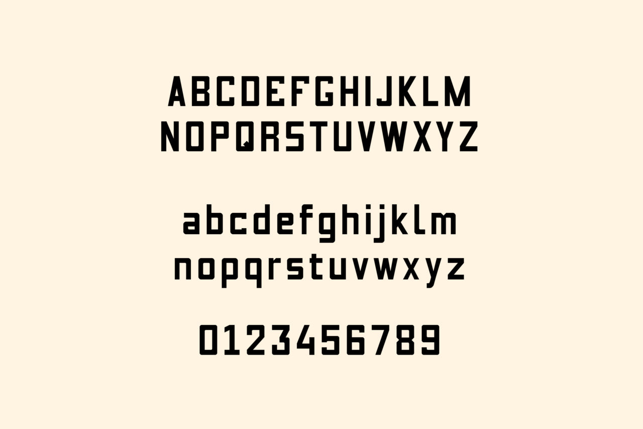
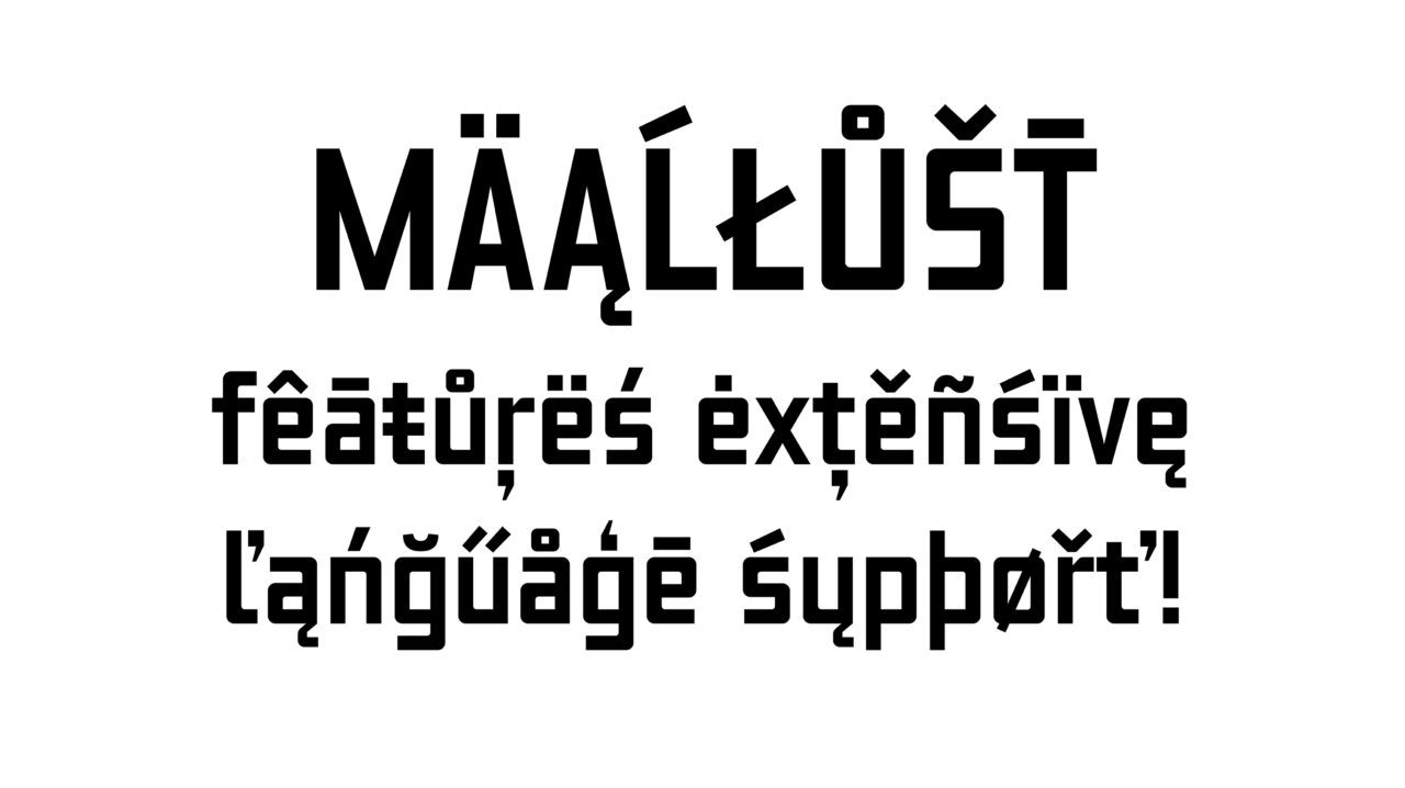
The history of Veenhuizen is closely connected to the Maatschappij van Weldadigheid (Society for Benevolence), which was founded in 1818. Vagabonds, beggars, widows and orphans were exiled to this distant place, where they were put to work. The educational slogans that adorn many buildings, such as ‘Order and Discipline’, inspired us to create our own Maallust typeface, which then formed the basis of the entire brand identity. We turned Maallust into a total brand experience, where you feel the quality and attention in every detail.
TASTE HISTORY
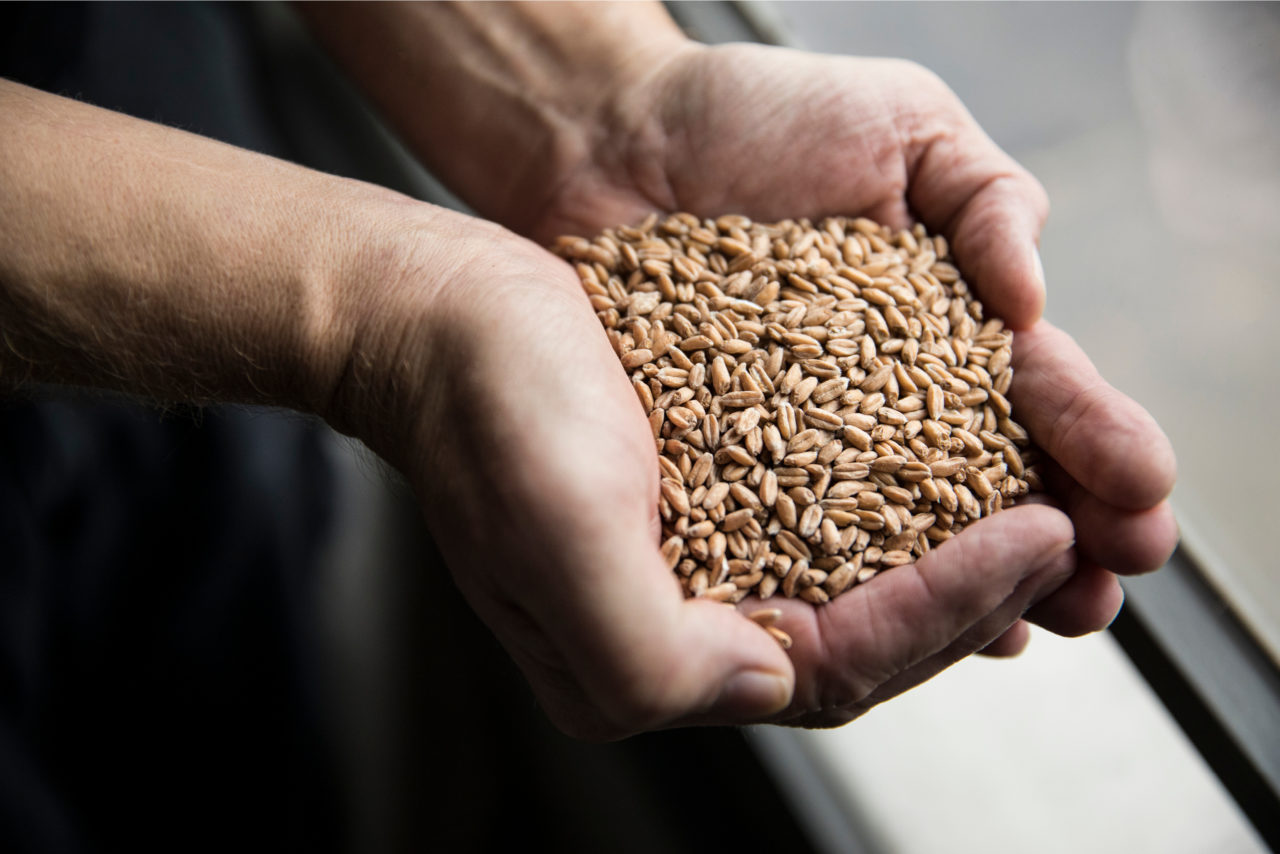
Thanks to our brand identity, Maallust is recognised by many as a distinctive brewery. It is a quality brand that is contemporary yet deeply anchored in the history of Veenhuizen. Taste their artisanal beers and go back in time. The success of the Brewery has helped Veenhuizen become known once again.
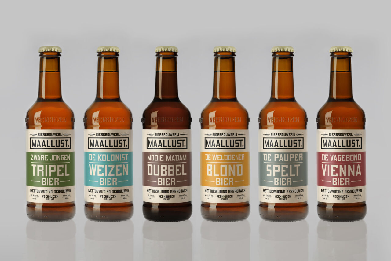
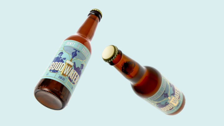
THE BOTTLE
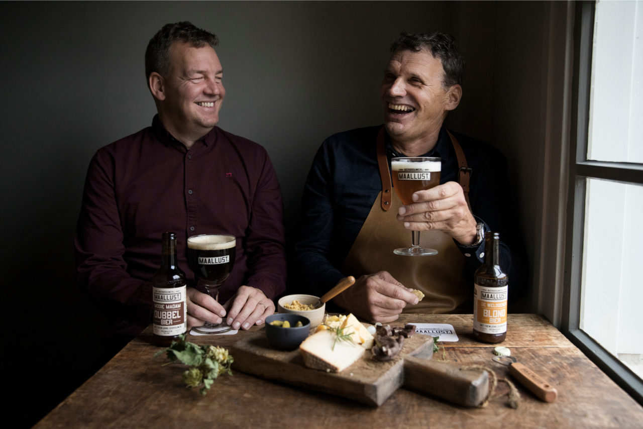
The success of Maallust and the high production numbers gave us the opportunity to develop a personalised beer bottle. Together with Studio Kees, we designed a bottle that was inspired by the shapes of the brewery’s characteristic copper kettles; the neck, for example, resembles the kettle’s ‘hat’. This way, the bottle is one more aspect of the brewery’s strong appearance, which enhances the experience of drinking craft beer.
Watch website here